2495 Main Street, Suite 410, Buffalo, NY 14214 | 716.873.5008 | Email Us >>
2495 Main Street, Suite 410, Buffalo, NY 14214 | 716.873.5008 | Email Us >>
PHASE I - For years the Buffalo Harbor Cruises vessels have been a staple on the waterways of Western New York. They are a recognizable part of the Buffalo summers. We decided to take advantage of the iconic vessel in a much more contemporary and stylized manner. Creating an image that both locals and tourists would recognize as fun, safe and intriguing. The cornerstone of the new brand was in place.

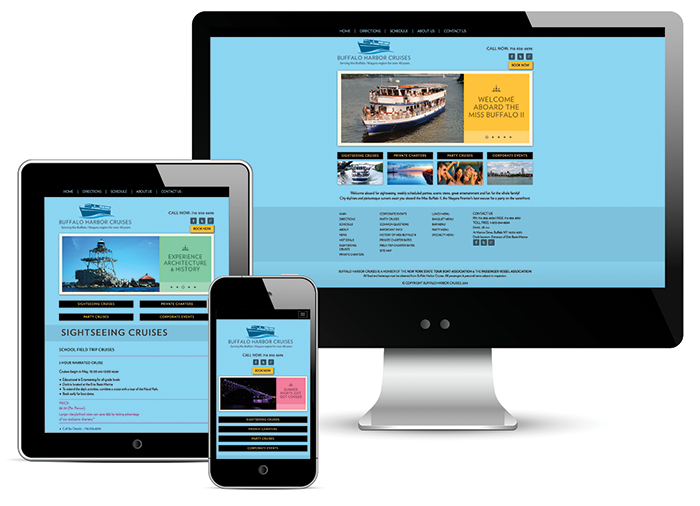
PHASE III – An integral part of any business that caters to out of town visitors is their brochure. This is the marketing piece that will sit in brochure racks, get you noticed and act as a gateway to your web site. We developed a brochure that was consistent with the new web site but would also stand out in the sea of other brochures. We examined various brochure racks around Western New York to fully understand the environment of the brochure and what elements it needed to stand out. Another piece of the re-branding solution was in place.
PHASE IV – A little gray building with a few sidewalk tent signs. That was the walk up presence BHC had up until 2016. With thousands of people passing their ticket booth everyday we realized the potential that was being missed because of lack of visibility. After a thorough exam of the landscape and traffic areas we were able to create an eye popping “hey look at us!” environment that could not be missed. The results were immediate. Walk up business increased as soon as the gray building was painted blue. Pulling elements from the web site, brochure and logo the final phase of the re-brand was in place. Buffalo Harbor Cruises now secured a cohesive and consistent brand that could be felt and seen throughout all their marketing. ALL ABOARD!!